Graphical Misinformation

Date: 2026-05-13
Category: Science Misinformation
All images are AI generated or shared
under Creative Commons licencing complying with rules for Attribution, Non-Commercial, No Derivatives, and Share Alike.
Image Link
AI generated
2026
Introduction
Data visualization is one of the most powerful tools in public communication - and one of the most easily weaponized. In the war against scientific consensus, the misleading graph has become a standard-issue weapon: persuasive, shareable, and just plausible enough to slip past a reader's skepticism. Unlike an outright lie, a deceptive chart wraps itself in the authority of data. The numbers are technically real. The manipulation is in the presentation.
"Any chart, no matter how well designed, will mislead us if we don't pay attention to it."
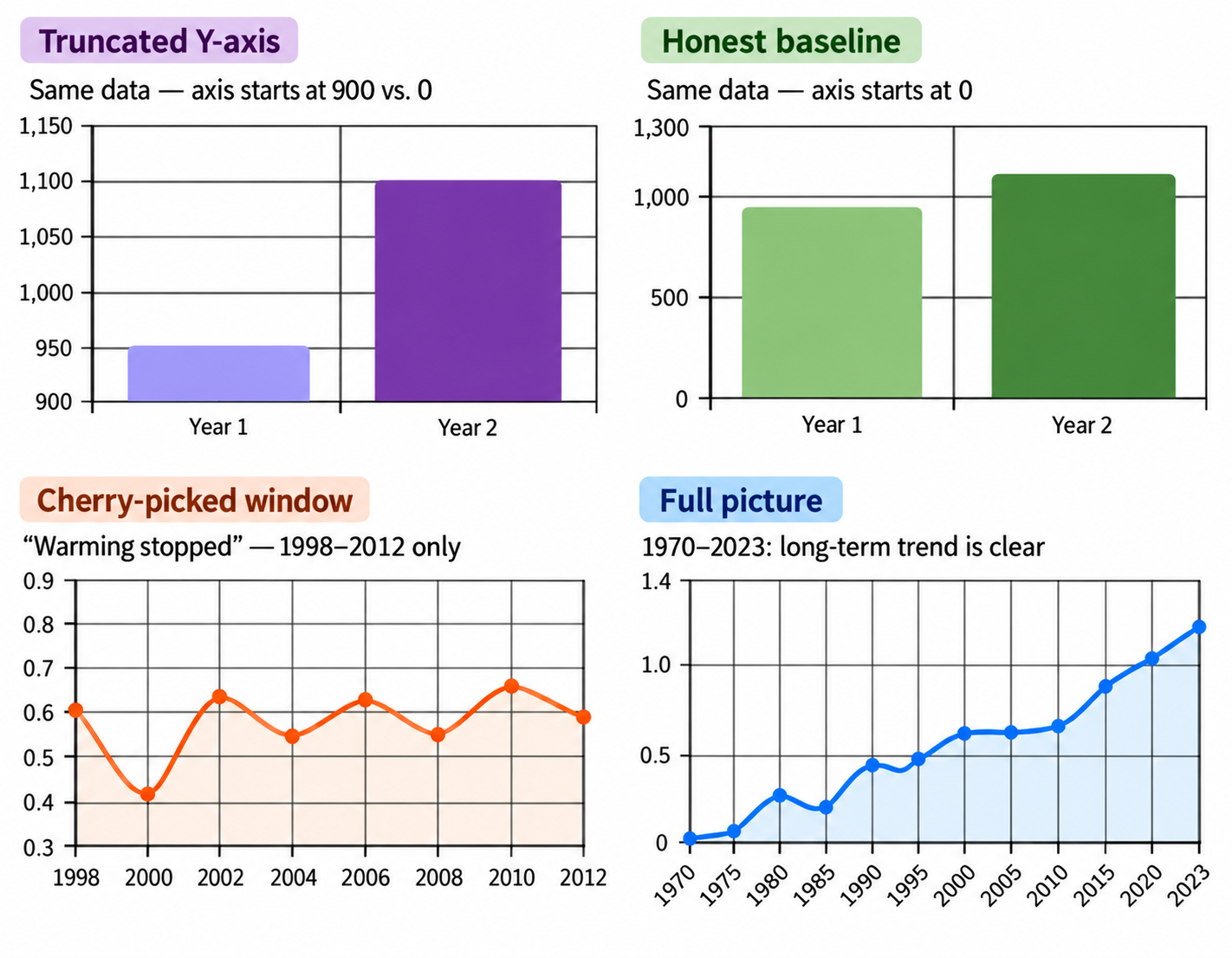
The most common trick is the truncated Y-axis - cutting the baseline of a bar or line chart so that small differences look catastrophic. During the height of COVID-19 vaccine debates, social media was flooded with charts showing "skyrocketing" adverse event reports from the VAERS database. The Y-axis would start at, say, 900 rather than zero, making a modest year-over-year increase look like a vertical cliff. The data wasn't fabricated, but the visual impression - alarm, crisis, proof of harm - absolutely was.
Climate denial has long leaned on the hockey stick inversion. Critics of Michael Mann's famous temperature reconstruction would cherry-pick a short time window, perhaps 1998 to 2012, when warming appeared to plateau, and present it as evidence that global warming had "stopped." No mention that the longer trend showed unmistakable, accelerating warming. The axes weren't mislabeled; the window was just carefully cropped to manufacture a false conclusion.
A related trick is dual-axis manipulation, placing two unrelated datasets on the same chart with independently scaled Y-axes to manufacture a spurious correlation. A favourite of anti-vaccination circles involved plotting rising autism diagnoses alongside rising vaccine rates - two trends that happened to move in the same direction between the 1990s and 2000s. The chart implies causation through visual proximity alone, exploiting the brain's tendency to perceive two lines moving together as meaningfully connected.
Then there is the inverted axis, used most notoriously in a 2014 Florida Department of Law Enforcement gun violence chart that plotted firearm deaths going downward after the state passed its "Stand Your Ground" law - while the deaths actually increased. The Y-axis ran from high at the bottom to zero at the top, so the rising death toll appeared as a falling line. Readers had to examine the numbers carefully to realize the visual told the exact opposite of the truth.
Perhaps the most insidious form is the percentage versus absolute number switch. An anti-GMO chart might show that a certain herbicide-resistant crop covers "350% more land than in 2000," which sounds alarming - but if the baseline was tiny, the absolute acreage may be unremarkable. Anti-science communicators instinctively reach for whichever framing (relative or absolute) produces the more frightening number, then present it without the context needed to evaluate it.
What makes these tactics so effective is that most people are not taught to read graphs critically. Science communicators, journalists, and educators increasingly recognize that data literacy - knowing to check the Y-axis baseline, ask about the time window, and question why two variables share a chart - is as essential as reading comprehension. Until that literacy becomes widespread, the misleading graph will remain one of the cheapest, most credible-looking tools in the anti-science arsenal.